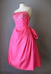

Designers always try to "balance" a design to make it pleasing to the eye. A large pocket at the hip will be balanced with a smaller one at the bust. Trim that accents a neckline is repeated at the waist, hips, or hem. A large busy print is balanced by using simple design lines and seams.
Other times, designers will use asymmetry to make a design look balanced, when its really not. Such is the case with the vintage 1940's dress shown above. Take a closer look at that neckline. The V shaped neck opening is slanted off to the right, but the two curving pieces of fabric on top swirl to the left and make the design pleasing to the eye. Balanced asymmetry.
But wait! This design is also balanced in another way! The soutache and rhinestone trim at the neckline is balanced by also adding it to the pocket flaps at the hips. Genius. Another reason to love vintage clothing!
See this dress and more at Couture Allure Vintage Fashion .


